Design System ServicesFigma Tokens. Storybook React Integration.
Bespoke design system services. Modular Figma component libraries, tokenized design systems, Storybook React/Tailwind integration, accessibility compliance, and developer documentation.
50%+ Velocity
Faster Frontend Build Time
Figma Auto-Layout
Component Variant Libraries
Storybook
React & Tailwind Integration
WCAG 2.2
AAA Accessibility Rated
Why Design Systems
50%+ faster development velocity. 100% brand consistency.
Enterprise design system engineering bridges the gap between Figma designs and React code with tokenized design pipelines.
50%+ Faster Development Velocity
Pre-built, reusable Figma components and matching React/Tailwind code blocks eliminate reinventing UI elements for every sprint.
100% Multi-Platform Brand Consistency
Centralized design tokens for colors, typography, spacing, and shadows ensuring 100% visual unity across web, mobile, and SaaS.
Seamless Figma-to-Code Sync
Connecting Figma variables with Style Dictionary to export automated CSS variables, Tailwind tokens, and Storybook specs.
Built-In WCAG 2.2 AAA Accessibility
Every design system component is pre-audited for color contrast, screen reader ARIA roles, and keyboard focus states.
Design System Capabilities
Figma component libraries, tokens & Storybook integration.
We deliver full-suite design system engineering covering Style Dictionary automation, dark mode tokens, Zeroheight docs, and React Native support.
Figma Component Library Architecture (Auto-Layout v5)
Building modular Figma components with auto-layout v5, variant properties, slot components, and responsive constraints.
Tokenized Design Systems (Style Dictionary)
Establishing multi-brand color tokens, typography scales, spacing units, and shadow elevations.
Storybook React & Tailwind CSS Integration
Setting up interactive Storybook component catalogs with props documentation, interactive controls, and visual tests.
Dark Mode & Multi-Theme Token Architecture
Structuring semantic color tokens that seamlessly swap between Light, Dark, High-Contrast, and Brand themes.
WCAG 2.2 AAA Accessibility Component Audits
Pre-auditing button focus rings, form input labels, modal focus traps, and screen reader announcements.
Zeroheight & Notion Design System Documentation
Writing comprehensive usage guidelines, dos and don'ts, code copy-paste snippets, and accessibility rules.
Design System Governance & Contribution Workflows
Establishing version control policies, component deprecation lifecycles, and cross-team contribution models.
Mobile (React Native / Flutter) Token Support
Exporting tokenized design system libraries matching React Native StyleSheet and Flutter ThemeData specs.
Industry Solutions
Design system component libraries for every commercial sector.
From B2B SaaS design systems to fintech banking component suites, healthcare patient portals, e-commerce, and logistics, we engineer design systems.
B2B SaaS Product Multi-Brand Design Systems
Building scalable Figma design systems powering multi-tenant SaaS products, dashboards, and client portals.
Fintech Compliant Banking Design Systems
Creating high-security financial design component libraries with strict accessibility and form validation UI.
Healthcare HIPAA Medical Design Component Suites
Building accessible healthcare design systems for patient portals, doctor dashboards, and EHR apps.
E-Commerce Multi-Storefront Design Systems
Crafting modular design systems for multi-brand e-commerce networks with shared cart and checkout UI.
Real Estate Property Portal Design Systems
Building design component libraries for property listing search grids, interactive maps, and scheduling.
Logistics GPS Telemetry & Fleet Design Systems
Designing high-density component libraries for fleet tracking maps, driver mobile apps, and dispatch UI.
Industrial IoT Factory HMI Component Systems
Crafting touch-screen industrial design systems for factory equipment control panels and machine UI.
Media Video Streaming Design Systems
Designing dark-mode video streaming component libraries for web, mobile apps, and Smart TV interfaces.
Legal & Corporate Enterprise Design Systems
Creating clean corporate design systems for document management, contract signing, and internal tools.
EdTech Learning Platform Component Systems
Building engaging student learning design systems for course players, quiz modules, and grade books.
On-Demand Booking & Marketplace Component Systems
Crafting two-sided marketplace design systems connecting customer apps with vendor management UI.
Government & Public Sector Accessible Design Systems
Designing 508-compliant component systems adhering to US Web Design System (USWDS) standards.
Design System Feature Modules
Production-ready design system feature components.
Complete list of Figma component cores, Style Dictionary token exporters, and Storybook React integration modules included.
Figma Component Library & Token Core
Standardized Figma components built with auto-layout v5 and component property variants.
Style Dictionary Automated Token Exporter
Automating design token export to CSS variables, SCSS, Tailwind config, and JSON arrays.
Storybook React Interactive Component Suite
Living component documentation portal with interactive prop controls and visual regression tests.
WCAG 2.2 AAA Accessibility Shield Guard
Enforcing AA/AAA color contrast, keyboard navigation focus rings, and ARIA attributes on all UI.
Semantic Multi-Theme & Dark Mode Swapper
Dynamic color token mapping enabling 1-click theme switching between Light and OLED Dark modes.
React Native & Flutter Mobile Token Exporter
Exporting tokenized design system specs for cross-platform mobile app development.
Zeroheight Online Guidelines Documentation
Publishing developer and designer documentation with code snippets, usage guidelines, and dos/don'ts.
Design System Versioning & Release Controller
Semantic versioning (SemVer) release management for design system updates and deprecations.
Audit Trail & Design Token Event Vault
Permanent timestamp logs recording every token modification, component addition, and release.
PostgreSQL Design System Analytics Vault
ACID database storage logging component adoption rates, storybook views, and usage metrics.
Single Sign-On (SSO)
Integrating SAML 2.0 and Azure AD for secure corporate Figma and Zeroheight design system access.
Automated Monthly Design System Health Reports
Cron-scheduled dispatches detailing component adoption rates, token usage coverage, and accessibility.
Technology & Tools
Modern design system tech stack. High throughput.
We use Figma Enterprise, Style Dictionary, Storybook React, Tailwind CSS Config, Zeroheight, and Stark Accessibility.
Design & Prototyping
- Figma Enterprise
- Framer Studio
- Adobe XD
- Principle / Lottie
Token & Code Libraries
- Style Dictionary
- Figma Variables API
- Storybook React
- Tailwind CSS Config
Frameworks Supported
- React / Next.js
- React Native
- Vue.js / Nuxt
- Flutter ThemeData
Documentation & Handoff
- Zeroheight Docs
- Figma Dev Mode
- Supernova.io
- Notion Workspace
Accessibility & Audit
- Stark Accessibility
- axe DevTools
- Visual Regression Tests
- WCAG 2.2 Standard
Asset Generation
- Custom SVG Libraries
- Lucide / Phosphor Icons
- LottieFiles Motion
- Vector Graphics
Security & Quality
Encrypted asset storage & Storybook visual regression QA.
NDAA NDA compliance, granular Figma file permissions, and automated token pipeline testing.
Design System Security Standards
Encrypted Design System Asset Storage Vault
Protecting proprietary brand tokens, component files, and design specs with AES-256 encryption.
NDAA & SOC 2 Compliant Design System Security
Enforcing strict non-disclosure security standards for unreleased commercial enterprise design systems.
Granular Figma File & Library Access Control
Restricting publish and edit rights for design system libraries to authorized system maintainers.
Immutable Design System Revision Audit Logs
Permanent timestamp logs recording every component release, token modification, and deprecation.
Isolated Password-Protected Documentation
Hosting Zeroheight and Storybook documentation portals on private password-protected domains.
QA & Ergonomics Verification
Figma Component Stress & Responsive Width QA
Testing design system components across extreme text lengths, dynamic content, and viewports.
WCAG 2.2 AA/AAA Contrast & Focus Ring QA
Auditing all color tokens with Stark checkers to guarantee 4.5:1 text contrast and visible focus rings.
Style Dictionary Automated Token Pipeline QA
Verifying JSON token export pipelines accurately map Figma variables to Tailwind CSS configs.
Storybook Visual Regression & Prop Test QA
Running Chromatic visual regression tests to catch unintended UI visual regressions in React code.
E2E Pixel-Perfect Design-to-Code Match QA
Comparing rendered Storybook React components with Figma designs to guarantee 100% fidelity.
12-Step Lifecycle
Proven design system methodology.
From UI audit to token architecture, Figma component engineering, pattern creation, Style Dictionary pipeline, Storybook React build, Zeroheight docs, and governance.
UI Audit & Token Taxonomy Discovery
Auditing existing application screens to identify duplicate UI elements, colors, and typography scales.
Design Token Architecture & Palette Setup
Defining foundational tokens (colors, typography, spacing, radii, shadows) and semantic token mappings.
Figma Component Library Engineering
Building atomic Figma components (buttons, inputs, dropdowns, cards) using auto-layout v5 and variants.
Complex Pattern & Template Creation
Assembling higher-level UI patterns (data tables, modal drawers, navigation bars, page layouts).
Style Dictionary & Token Pipeline Setup
Connecting Figma Variables API to Style Dictionary to automate CSS variable and Tailwind token export.
Storybook React Component Build
Building matching React/Next.js components in Storybook with interactive props controls and tests.
Zeroheight Documentation Publishing
Publishing developer guidelines, component code copy-paste snippets, usage dos/don'ts, and WCAG rules.
Governance & Continuous SLA Support
Delivering 99.99% system availability SLAs, quarterly component audits, and design token updates.
Industry Domain Focus
Design system component libraries built for your sector.
We translate brand guidelines into scalable Figma components and matching React code tokens.
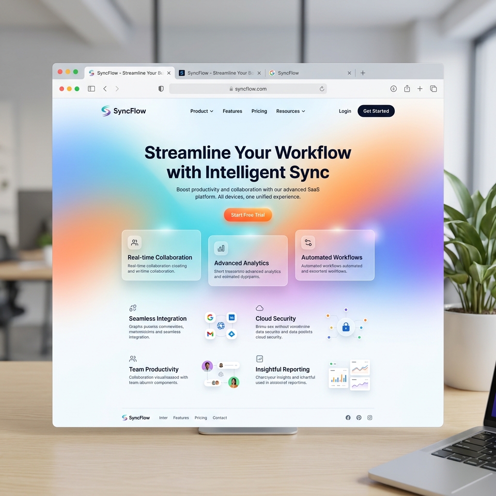
Enterprise B2B & SaaS
Building scalable Figma design systems powering multi-tenant SaaS products, dashboards, and client portals.

Healthcare & Life Sciences
Building accessible healthcare design systems for patient portals, doctor dashboards, and EHR apps.

FinTech & Financial Services
Creating high-security financial design component libraries with strict accessibility and form validation UI.

Real Estate & PropTech
Building design component libraries for property listing search grids, interactive maps, and scheduling.

Logistics & Supply Chain
Designing high-density component libraries for fleet tracking maps, driver mobile apps, and dispatch UI.
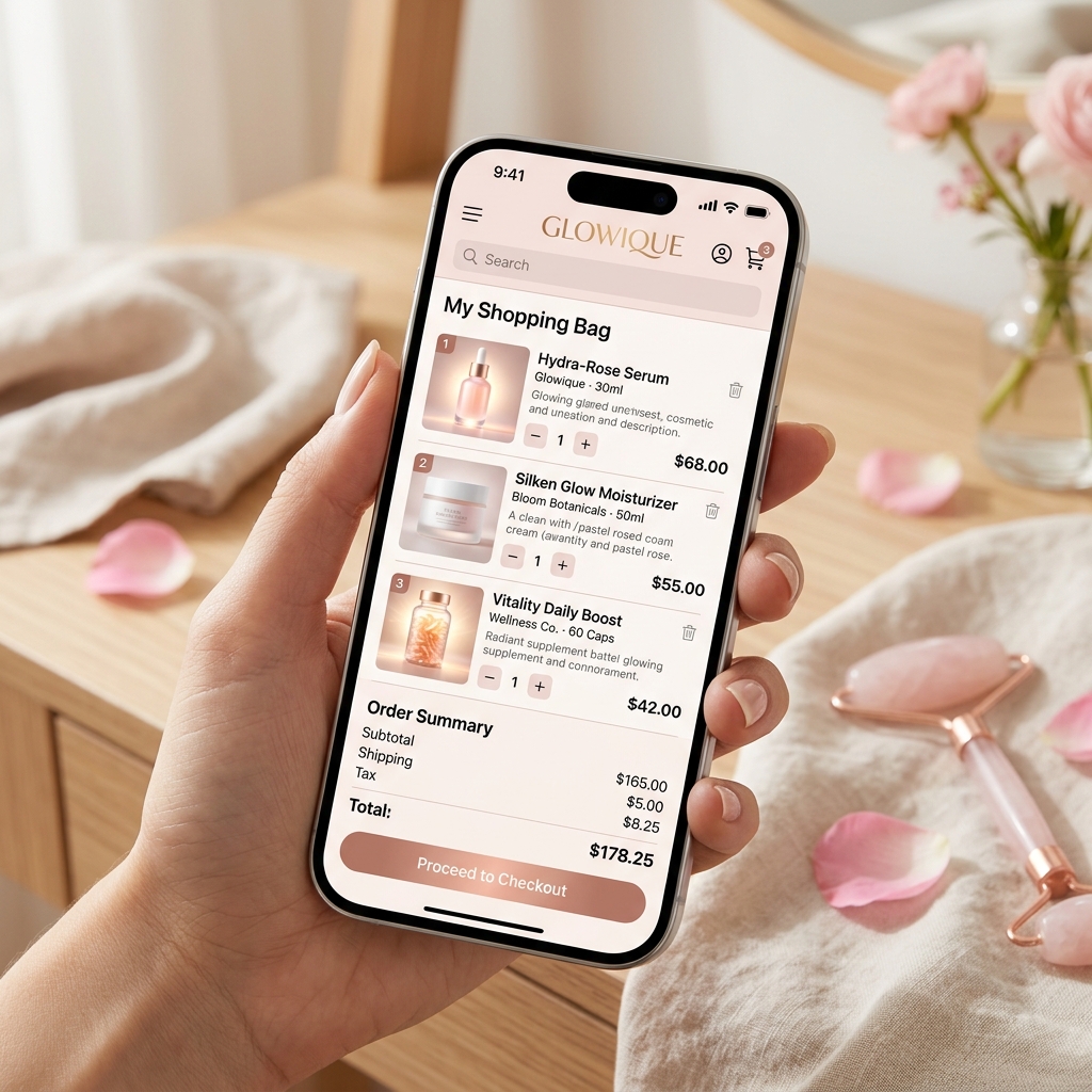
E-Commerce & Marketplaces
Crafting modular design systems for multi-brand e-commerce networks with shared cart and checkout UI.
Related Services
Explore complementary UI/UX design services.
FAQ
Design Systems FAQs.
Questions we get before kicking off Figma design system and Storybook component library engagements.
- Design tokens are the central source of truth for visual values (colors, typography, spacing, shadows) stored in platform-agnostic format (JSON). Tokens allow a single design update in Figma to automatically sync across React web apps, iOS apps, and Android apps without manual code edits.
Let's build something great
Tell us your design system goals.We'll build your Figma & Storybook design system.
Schedule a free design system audit with our senior design architects. Receive a component audit, token architecture blueprint, and project estimate.